

Magento Category Page SEO: Add Content Without Hurting UX

A Magento category page needs written content to rank in search and get cited by AI answer engines, but that content can't come at the cost of the products. The fix is placement, not word count: keep a short intro above the grid, put the products in the prime position, and move the longer buying guidance and FAQs below the grid where they help without burying what people came to buy. Done that way, one page serves shoppers and search at the same time.
Why do category pages need content at all?
Because a category page is often the strongest ranking asset a store has, and a bare grid of product tiles gives search engines and AI answer models almost nothing to read. A page that's just thumbnails and prices has no context about what the category is, who it's for, or how to choose - so it competes on product names alone and rarely wins broader, higher-intent searches.
The catch is that the content shoppers need is short, and the content search rewards is longer. Resolve that tension with layout rather than by picking one audience. A shopper skimming for a product and a search crawler reading for context want different things from the same URL, and both can have what they need if the page is ordered right.
Where should category content go without hurting UX?
Short context above the grid, everything longer below it. The intro above the products should be one or two sentences that confirm the shopper is in the right place, no more. The detailed material - buying guidance, specification explainers, and an FAQ - belongs below the product grid, where it's available to anyone who scrolls and to any crawler, but never in the way of the products.
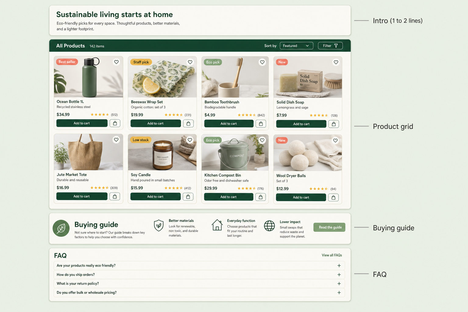
The pattern that breaks UX is the block of intro copy dumped above the grid to hit a word count, pushing the first product row off the visible screen. On mobile especially, three paragraphs of "welcome to our range of..." means a shopper scrolls past a wall of text before seeing a single product. That's the layout to avoid, and it's the default outcome when category content is treated as an SEO checkbox rather than a design decision.
What content actually earns its place on a category page?
Content that answers a decision the shopper is making, not content that repeats the category name in different words. A recommended structure that ranks without annoying anyone looks like this:
| Position | Content | Purpose |
|---|---|---|
| Above grid | 1-2 sentence intro | Confirm the shopper is in the right place |
| The grid | Products, well merchandised | The actual job of the page |
| Below grid | Buying guidance / how to choose | Help the undecided, add context for search |
| Below grid | FAQ block (3-6 questions) | Answer real queries, win AI citations |
| Below grid | Internal links to related categories | Spread authority, help navigation |
The FAQ block is the part that pays off in AI search. Answer engines lift self-contained question-and-answer passages, so a category FAQ that answers genuine buying questions ("what size do I need", "how do I care for this") in a couple of clean sentences each is exactly the kind of passage that gets quoted. Keep the questions real and the answers tight - the same rules a good article follows.
How this applies to Magento 2
Magento 2 gives every category a single Description field (Catalog > Categories > Content), rendered in a fixed position by your theme - usually above or below the grid, with no control over splitting content between the two. There's a "Display Mode" setting to show static content, products, or both, but it treats the description as one lump. So the native tools push you toward the exact problem above: one big block, one position, no place for a properly structured FAQ. Adobe's category docs cover the standard fields, and they confirm there's no native above-and-below split.
The practical Magento plan is to break category content into a short intro above the grid and a richer block below it, add a structured FAQ that AI engines can cite, and keep the product grid in the position shoppers expect - without editing theme templates for every category by hand.
Where Moogento helps
CategoryContent splits category content into the two positions Magento won't. It adds per-category fields for text above the product grid and text below it, so you can keep the intro to a line or two up top and put the substantial buying guidance underneath the products. It also adds an FAQ tab block that renders after the product grid, which is on by default, giving you a proper place for the question-and-answer content that both shoppers and AI answer engines want - without dropping it above the grid where it would bury the products.
Content placement only solves half the page, though. The other half is the grid itself: there's no point protecting the product row's position if the products in it are sold out or badly ordered. Smartlistings handles that side by scoring and sorting the grid so in-stock, in-demand products lead. And for the wider technical SEO picture - metadata, structured data, and how category URLs are built - the Magento SEO guide covers the settings that decide whether these pages get indexed well in the first place.
Category content audit checklist
- Load a category on mobile. Is the first product visible without scrolling, or is there a wall of intro copy first?
- Is there any written context at all, or is the page just a grid of tiles with no words for search to read?
- Does the page have an FAQ that answers real buying questions, structured so each answer stands alone?
- Is the longer content below the grid rather than above it?
- Do the FAQ answers read like something an AI could quote directly, in two or three clean sentences?
- Are there internal links to related categories, with descriptive anchor text?
- Is the intro unique to this category, or a templated "welcome to our range of X" repeated everywhere?
FAQ
Does adding text to a category page help SEO?
Yes, when the text adds genuine context and answers buying questions rather than repeating the category name. Search engines and AI answer models need words to understand what a category is and who it's for. The mistake is placing that text above the product grid, which hurts the shopping experience - keep the intro short up top and the detail below the grid.
Where should category description content go in Magento?
Split it. A one or two sentence intro above the grid confirms the shopper is in the right place; the buying guidance and FAQ go below the grid where they add value without burying products. Magento's native single Description field renders in one fixed position, so achieving the split usually needs a module such as CategoryContent.
Should category pages have an FAQ section?
Yes, and it's increasingly worth the effort for AI search. Answer engines cite self-contained question-and-answer passages, so a category FAQ answering real buying questions in a couple of clean sentences each is highly citable. Place it below the product grid so it never gets in the way of the products.
How much content is too much on a category page?
Too much is any amount that pushes the first product row below the fold, especially on mobile. There's no magic word count - the test is whether a shopper sees products quickly. Long content isn't the problem; long content in the wrong position is.
Open your best category on a phone and count the seconds before you see a product. If it's more than a moment, your SEO content is winning a fight it shouldn't be having - move it below the grid and let the products lead.


