

The Magento Thank You Page Is Wasted Space: 12 Jobs It Should Be Doing

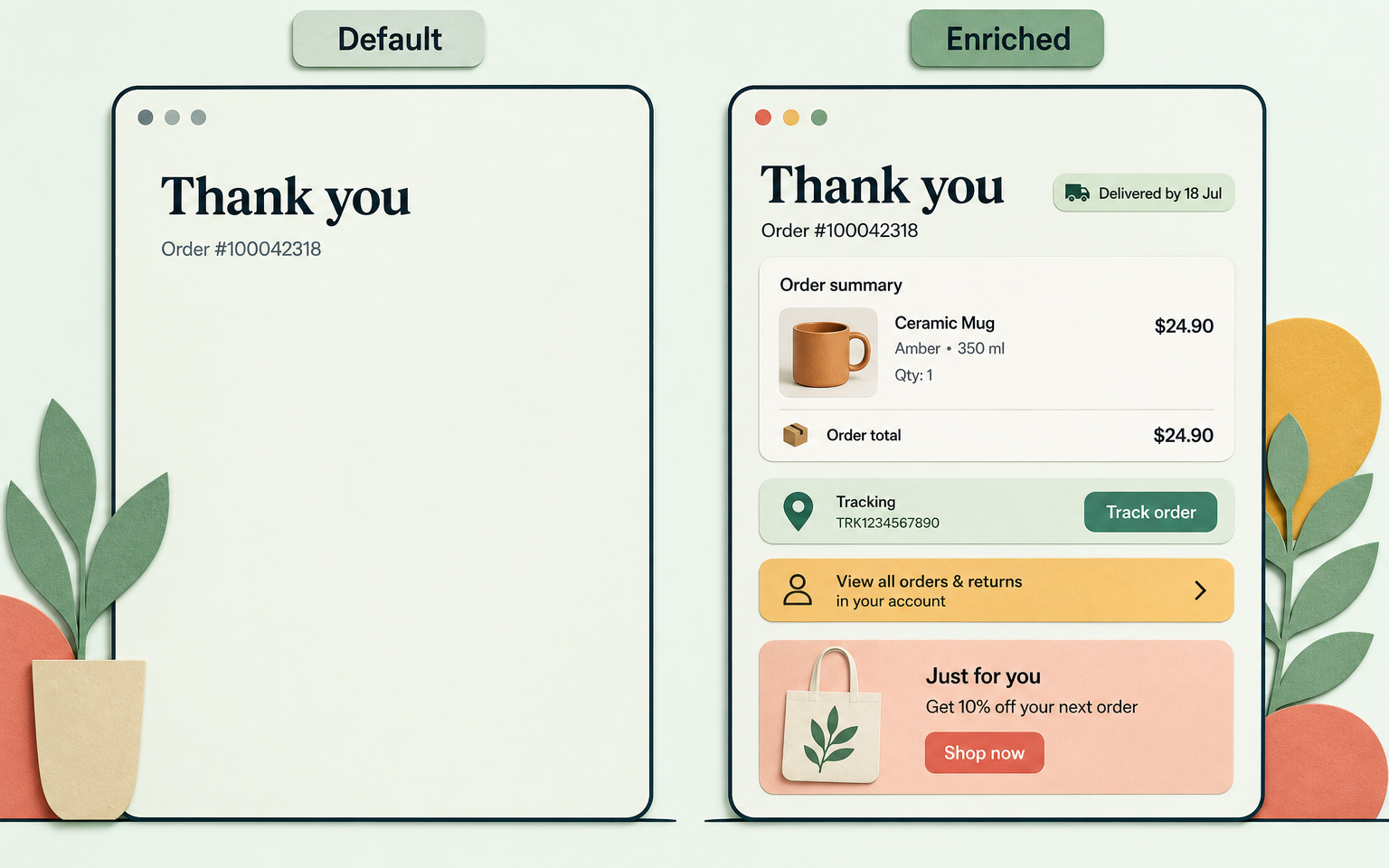
The default Magento thank you page shows an order number, promises an email, and stops. That's wasted space, because it's the one page 100% of your buyers see, at the exact moment they're most receptive. A good order confirmation page does twelve jobs: it confirms, reassures about delivery, then quietly converts guests to accounts, captures opt-ins, and makes one well-chosen offer.
Why is the order confirmation page worth fixing?
Three reasons. First, reach: unlike any campaign, every single buyer lands here. Second, mood: the decision anxiety is over, and buyers actively look for confirmation they chose well - CXL calls this post-purchase rationalisation, and it's why offers land better here than before payment. Third, risk: the money is already taken. A page that shows nothing more than an order number, on the one page every buyer is guaranteed to see, is a dead end built on purpose - Baymard's research on confirmation pages reaches the same conclusion from usability testing.
The email equivalent proves the attention is real: Klaviyo's benchmark across 183,000+ merchants found post-purchase flows have the highest open rate of any automated email, at 58% (their own caveat: Apple's mail privacy inflates all open rates). People pay attention right after buying. The page they're already on shouldn't squander that.
What does the default Magento 2 success page actually show?
Almost nothing. As of Magento 2.4.9, checkout/onepage/success gives a logged-in customer the order number as a link, a "we'll email you" line, and a continue-shopping button. Guests get a plain order number and a registration nudge. No delivery estimate, no order contents, no tracking, no offers. Customising it means a checkout_onepage_success.xml layout file and templates, which is developer work most stores never schedule.
The 12 jobs a thank-you page should do
Ordered deliberately: reassurance first, growth last. A page that sells before it confirms gets neither.
- Confirm the order - number, items, quantities, payment. Non-negotiable: get this wrong and nothing else on the page matters.
- Set delivery expectations - a "delivered by" date beats a carrier name. This is the single biggest support-ticket preventer on the page.
- Confirm the email is coming - a buyer who isn't told a receipt email is on its way will often sit on the page waiting for one, or open a new tab to check their inbox. Say it's on the way and they can leave.
- Link to tracking - even before dispatch, show where tracking will live.
- Convert guests to account holders - the delayed-registration pattern. Forcing registration before purchase costs a meaningful share of would-be buyers industry-wide; the same offer after payment is one click, with the shopper's details already entered from the order.
- Capture the newsletter opt-in - pair it with a next-purchase incentive. There's more room to sell the benefit here than in checkout.
- Make one offer - a complementary product with an add-to-order path. One. Vendor benchmarks for confirmation-page offers put average conversion around 1.7%, with strong implementations reaching 5 to 10%.
- Invite a referral - a "give and get" incentive lands well while goodwill is at its peak, right on the confirmation page.
- Enrol in loyalty - use the page for the rewards programme; points from the order just placed make the pitch concrete.
- Ask one survey question - "how did you hear about us?" or "why did you buy today?" One or two questions, no more.
- Offer helpful resources - setup guides or care instructions for what was bought. This is support deflection dressed as a favour.
- Show support and returns paths - a visible "something wrong?" link routes problems to your helpdesk instead of a chargeback.
A maturity model for confirmation pages
| Stage | What the page does | Buyer's takeaway |
|---|---|---|
| 1. Receipt | Order number and an email promise (the Magento default) | "I hope that worked" |
| 2. Reassure | Full order summary, delivery date, tracking link, support path | "I know exactly what happens next" |
| 3. Guide | Adds account creation, opt-in, resources for the purchase | "This store makes things easy" |
| 4. Grow | Adds one offer, referral or loyalty hook, one survey question | "I'll be back, and I might bring someone" |
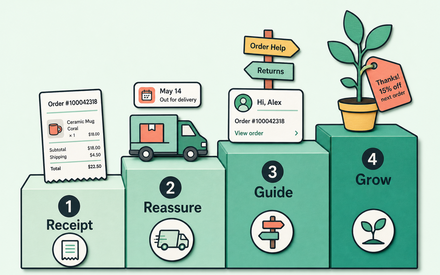
The failure mode at stage 4 is over-promotion: stacked offers, countdown pressure, and guilt-copy decline buttons ("No thanks, I like paying full price") - the confirmshaming pattern that EU regulators now formally class as a dark pattern. The order details must stay the loudest thing on the page. If a screenshot of your confirmation page looks like a campaign landing page, you've overshot.
How this applies to Magento 2
Everything above is buildable on Magento 2: the success page is a normal layout handle, so a developer can add blocks for order details, delivery estimates, and a registration prompt. The practical catches are upkeep (the page breaks quietly during upgrades because nobody looks at it), the discount mechanics (a naive "add to order" implementation creates a second order and a second shipping charge), and measurement (without UTM discipline you'll never know the page's revenue). Budget for those three or the project stalls after the mockup.
Where Moogento helps
ThanksEasy rebuilds the success page in admin config rather than layout XML. The reassurance layer comes first: order details with "shipped by" and "delivered by" date estimates (you set the day offsets, defaults are 5 and 14 days), a personalised success message, and calendar or QR add-ons. Then the growth layer, with the guardrails built in: two configurable content slots (complementary products, a single featured product, a CMS block, or your own HTML), an optional time-limited offer that defaults to expiring in one hour, a popup that shows at most once per day per shopper, and a one-click account prompt for guests. Offers automatically exclude out-of-stock, zero-price and unphotographed products, and every element carries UTM tags so the revenue shows up attributed in analytics.
Pair it with TrackEasy to give that tracking link a branded destination with a plain-language delivery timeline, and GiftEasy if the referral job matters to you - its Give & Get programme handles the reward mechanics (giver card, minimum order for the friend, exclusion filters) that a hand-rolled referral link never gets right.
Thank-you page audit checklist
- Place a test order. Screenshot the confirmation page on desktop and mobile.
- Can you see the full order contents without clicking?
- Is there a delivery date or window, not just a shipping method name?
- Is there a tracking link or a clear statement of when tracking arrives?
- As a guest: how many fields stand between you and an account? (Target: one.)
- Count the offers. More than one competing offer means none of them is working.
- Is there a support or returns link visible without scrolling?
- Check your analytics: does the page's engagement show up attributed anywhere?
- Repeat after every Magento upgrade - this page breaks quietly.
FAQ
What should an ecommerce order confirmation page include?
In priority order: full order summary, a delivery expectation with dates, confirmation that a receipt email is coming, a tracking path, then at most one growth element each from accounts, opt-ins, offers, referrals or surveys. Reassurance always renders above revenue.
Can I add offers to the Magento 2 success page without an extension?
Yes, with development work: the page uses the checkout_onepage_success layout handle, so blocks can be added like any other page. The hard parts are the offer pricing (avoiding a second order with second shipping), suppression logic, and keeping it alive through upgrades - which is what modules like ThanksEasy package up.
Does asking guests to register after purchase actually work?
It's the pattern UX research recommends: forcing registration before payment loses roughly a quarter of would-be buyers, while a post-purchase prompt is one click because the customer's details are already in the order. The page should pre-fill everything and ask only for a password.
Is it safe to put discounts on the thank-you page?
One time-limited, clearly optional discount is fine and can't hurt the sale that's already complete. The risks are tone (guilt-copy and fake urgency damage trust and are now regulated as dark patterns in the EU) and clutter that buries the order details buyers came to check.
Pull up your own confirmation page today and score it against the maturity table. Most Magento stores are at stage 1, which means the cheapest conversion project you have is one page long.


