

Product Page or Cart? Where Magento Stores Should Put Add-On Offers

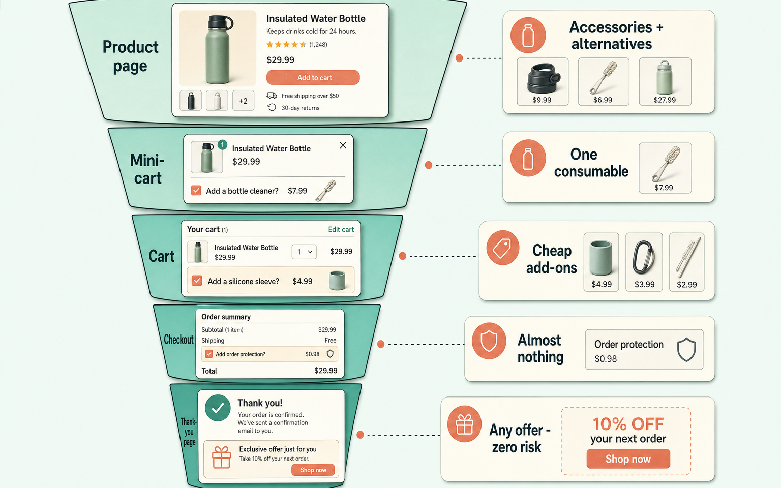
Add-on offers in a Magento store work when their placement matches the shopper's intent. Product pages suit accessories and alternatives, because the shopper is still deciding. The cart suits cheap, complementary items that don't restart the decision. Checkout should carry almost nothing, since anything that distracts from payment costs more than it adds. The order confirmation page is the zero-risk slot most Magento stores leave empty.
Why does the same offer work in one place and fail in another?
Because each stage of the journey carries a different level of commitment. On a product page, the shopper is comparing and gathering: an accessory block adds information. In the cart, they've decided what to buy and are checking the total: a low-cost add-on fits, a rival product invites second thoughts. In checkout, they're entering card details, and every extra decision is friction. Checkout is the wrong place for most add-on offers, and any format that forces a choice before the shopper can continue reads as aggressive at exactly the moment they're least receptive to it.
The reverse mistake is just as common. A protection plan pitched on the product page, before the shopper has committed to the main item, asks them to insure something they haven't decided to buy.
What placement patterns work at each stage?
Six patterns cover most of what you'll see in the wild, mapped to the stage they suit:
| Pattern | Where | Best for | Risk |
|---|---|---|---|
| Alternatives and accessories as separate blocks | Product page | Helping shoppers compare, then complete the kit | Low |
| Rich suggestion tiles (image, price, key spec) | Product page | Making add-ons actionable at a glance | Low |
| Themed complementary block | Cart | Consumables and low-cost extras that fit the basket | Low to medium |
| Embedded low-friction add-on | Checkout | Free samples, warranty tick-boxes that don't block progress | Medium |
| Interstitial offer step | Mid-checkout | Nothing. Shoppers read it as a toll gate | High |
| Post-purchase offer | Order confirmation | Anything - the sale is already banked | Near zero |
Some patterns worth naming individually. A well-built "frequently bought together" block sits under the buy box on the product page, built from co-purchase data, and lets shoppers add the whole bundle in one tap - the format only works when the pairing is genuinely common, not just in the same category. Mixing true alternatives (a rival model) into the same grid as true accessories (a case, a cable) is a common mistake: the shopper has to work out which kind of choice they're being offered before they can act on it, and most implementations don't separate the two clearly. A checkout-stage free-sample picker is one of the few offer formats that survives checkout intact, because it costs nothing and blocks nothing - no decision, no friction. A protection-plan pitch that also stays available from the order history after purchase quietly admits the checkout moment isn't the only window worth having.
How risky are offers inside checkout?
Riskier than the extra revenue is worth, in most cases. Anything that distracts a shopper from completing payment costs more in abandoned orders than the add-on earns in extra revenue - and checkout is exactly where a store has the least room to spend that trust. Baymard's checkout research puts the average large-site conversion upside from checkout fixes at roughly a third, which gives a sense of scale: that's the kind of number a distracting warranty pitch puts at risk for a fraction of the reward.
Post-purchase conversion numbers mostly come from vendors selling post-purchase tooling, so treat the specific figures as vendor-reported: confirmation-page offer conversion around 1.7% on average, with strong implementations reaching 5 to 10%. The structural point stands on its own regardless of the exact number: an offer after payment cannot lose you the sale.
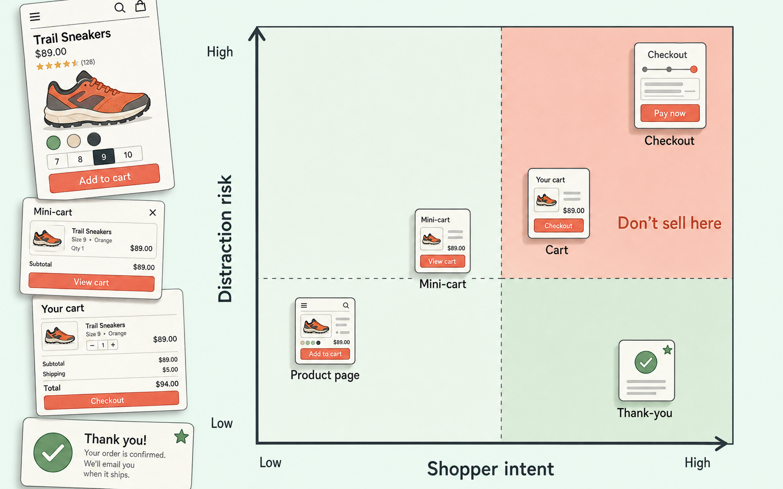
How this applies to Magento 2
Magento 2 Open Source hard-wires each suggestion type to one location: related products and up-sells render on the product page, and basket suggestions render under the cart. All three come from hand-set links on each product record, so there's no rule logic, no stock awareness, and no way to vary placement by order value or customer group without code. As of Magento 2.4.9 the checkout itself has no native offer slot at all, and the order confirmation page (checkout/onepage/success) ships nearly empty: order number, an email note, and a registration prompt.
That's a reasonable default. The dangerous slots are locked shut. But it also means the two highest-value placements - a disciplined cart block and a post-purchase offer - need either custom build or an extension.
Where Moogento helps
We split the journey between two modules on purpose, because the pre-payment and post-payment jobs are different.
SmartCart handles the pre-payment side with placement discipline built in. It can show offers in the mini-cart, cart page, and checkout, but each surface has its own rules: the cart page caps at two offers by default, the mini-cart and checkout show one, and you can restrict any surface to "Essential" intent rules only, so checkout never carries a nice-to-have. The moment a shopper starts Apple Pay, Google Pay, PayPal Express or Stripe Link, offers stand down automatically. And one quiet-surface impression per quote is the default: show once, then stop.
ThanksEasy handles the page after payment. It rebuilds the Magento success page with order details and delivery expectations first, then adds offer slots: a complementary-products block or single-product feature, an optional time-limited discount (one hour by default), and a one-click account prompt for guests. Because the order is already placed, the worst an ignored offer can do is nothing. The rest of the range is in the Moogento docs index.
Offer placement audit checklist
- List every place your store currently shows suggestions: product page, mini-cart, cart, checkout, confirmation page, emails.
- For each, write down the offer type shown. Does it match the intent at that stage?
- Does anything in checkout require a click to dismiss before paying? Remove it.
- Are alternatives (rival products) ever shown in the cart? Move them to the product page.
- Is your confirmation page doing any work at all? If it's the bare Magento default, that's your cheapest test.
- Check offers against order value: do finance or threshold promotions appear on tiny baskets?
- On mobile, walk the full journey. Count how many times you scroll past suggestions to reach the primary button.
- Do express checkout flows (Apple Pay, PayPal) skip your offer surfaces cleanly?
FAQ
Should add-on offers go on the product page or the cart page?
Both, but with different jobs. Product pages suit accessories and comparable alternatives because the shopper is still deciding. The cart suits cheap complementary items that extend what's already chosen. The one rule that holds everywhere: never show an alternative to a cart item in the cart, because it reopens a closed decision.
Do offers in checkout increase average order value?
Sometimes, but the trade is poor. Published checkout research consistently finds that distraction during payment costs completed orders, and a forced offer step reads as a toll gate. If you must have a checkout offer, make it a no-decision add like a free sample or a single tick-box, never an interstitial.
Can Magento 2 show offers on the order confirmation page natively?
No. As of Magento 2.4.9, the Open Source success page shows the order number, an email confirmation note, and a registration link. Adding offers, delivery estimates or account prompts there needs layout customisation or a module such as ThanksEasy.
How many add-on offers should show at each stage?
Product page: a handful, split into labelled groups. Cart: one or two. Checkout: zero or one no-decision add. Confirmation page: one clear offer beats three competing ones - order details must stay the loudest thing on the page.
Placement beats persuasion. Get the right offer type on the right page and the copy barely matters; get it wrong and no headline saves it.


